(Sheldon Brown Web Services no longer exists. This page is here in memory of Sheldon.)
Getting the Most out of your Browser
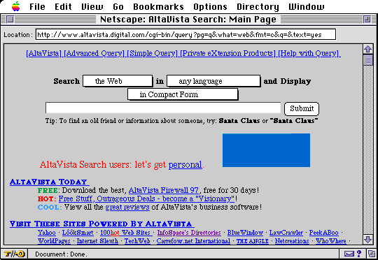
Does your browser look like this when you open it up?
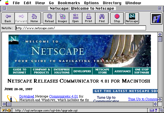
You can do better than that!
This is the standard "
default" setting of
Netscape, but it is easy to customize your browser, simply using the
pull-down menus, to make more efficient use of your time and your screen.
Most browsers come set up to make their operation as easy as possible for a beginner to understand. As you cease to be a beginner, you can get rid of these "training wheels." When you do, you will be able to use your browser just as well, but devote more of the available screen area to what you want to look at.
While this article uses the Macintosh version of the Netscape browser as an example, the procedures are quite similar on other computers and other browsers, such as Microsoft Internet Explorer, or the America Online browser.
| In this example, the directory buttons and their icons take up an unreasonable amount of the vertical space on the screen. |
In this version, the buttons have had their icons turned off, by using the "General Preferences" window. |
In this version, the directory buttons have been eliminated altogether. Notice how much more text is now visible from the same Web page. |
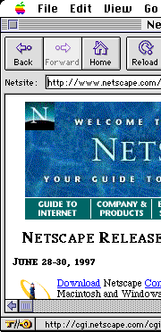 |
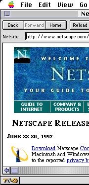 |
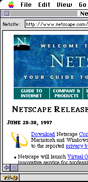 |
To eliminate the toolbar entirely, pull down the "Options" menu and un-select the option "Show Toolbar." The toolbar is actually un-necessary, because everything that you can do with it can also be done by using one of the pull-down menus and/or the mouse button.
Your Starting Page
Since the example is a Netscape browser, it isn't surprising that it opens up Netscape's home page as a starting point...but this is probably not the most useful way for you to leave it...wouldn't it be more useful if it came up with your favorite
search engine or other favorite page instead?
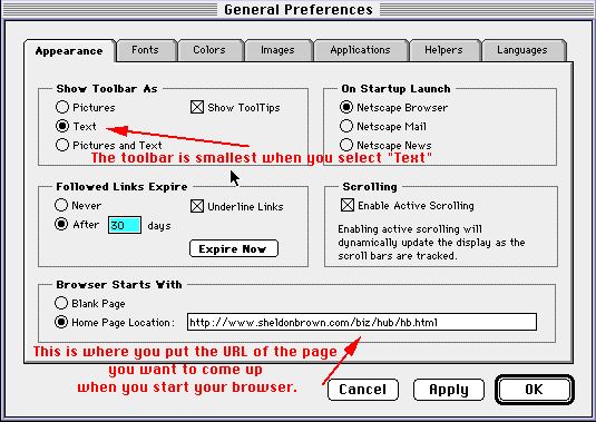
To do this, use the "General Preferences" window and replace "http://www.netscape.com"in the "Home Page Location" box with the URL of your favorite search engine or other Web page. Once you have done this, your chosen page will come up every time you start Netscape, or whenever you click on the "Home" button, or select "Home" from the "Go" menu.


Or, how about opening up your
Bookmark file? You can pull down the "
File" menu and select the option "
Open File." This will allow you to open up any file on your hard disc. Look for a file called "
Bookmarks.html" or "
Bookmarks.html" and click on it. This will open up your bookmarks on screen:
When you have your bookmark file open, you will see its location listed in the "
Location:" window at the top of your page, where the URL of a Web site normally appears. Copy this address,
open up the General Preferences window and paste the address into the "
Home page location" box.
Bookmarks
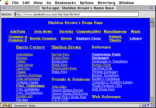
While you can use the standard bookmark file as a starting page, if you learn to use HTML, you can make your own HTML bookmark page, as I have:
My "
Home Base" page uses the
<TABLE></TABLE> function to create multiple columns, so that I can get more onto a single screen. I have links to additional, similar screens organized by subject. It is not necessary to have a Web site to do this, you can do it as a file on your own hard disc. Indeed, mine started out that way. Since I had a Web site, I decided to put it up, so that I could access my bookmarks while using somebody else's computer away from home. At first, this was a "
secret URL", but I decided to make it public, since other people have also found it useful.
Readability
blockquote
columns
Site Organization
File names and structure
Page sizes
Stealing HTML
"View Source"
The "General Preferences" Window
To get to the "General Preferences" window, pull down the "Options" menu to select "General Preferences" The result will look like this:
Handling Indundations of Email
I typically get 200-300 email messages per day, which I manage by filtering messages from different mailing lists into different mailboxes. I use
Eudora Pro, and I can't recommend it highly enough. For one thing, the filtering option makes digests unnecessary.
The mail addressed to mailing lists goes to individual mailboxes, one for each list. When I feel like checking out the Bikecurrent, BOB, Cdnfolk, CRW, HBS, HPV, LABmembers, Maritime History, Massbike, Moulton, Oysterband, Tandem, Touring, or Savoynet list, I go the appropriate mailbox, and all the messages are there. It is easier to follow the threads when the different lists are separated.
I also use a filter to raise the "priority" of messages that are addressed to me specifically, as distinct from those directed to a list. This causes their headers to appear in blue on my screen. This lets me spot personal mail at a glance, whether in a mailing-list mailbox, or in my main in box. This also pretty much separates out the spam messages, which don't usually have my address in the to: header, so I can delete them without wasting time reading them.
There are other programs which have similar features, so check out the options of your own system before you switch.


If you would like to make a link or bookmark to this page, the URL is:
https://www.sheldonbrown.com/web_tips.html
Last Updated: by Harriet Fell


![]()
![]()

![]()
![]()